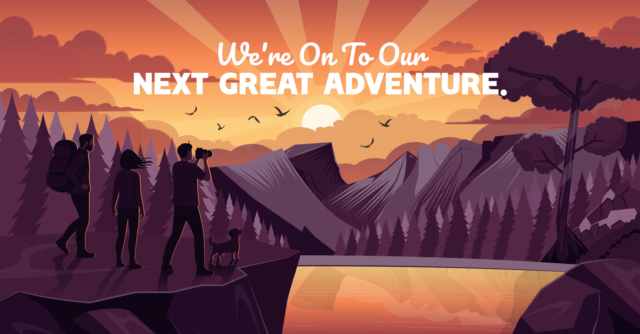
Connect with us

Our
Task
"Create a new identity for a key educational nonprofit that matched their mighty mission"

The Backstory

When members of the Wichita chapter of Communities in Schools wanted to take the organization in a new direction, they faced some serious obstacles – not the least of which was needing a new identity to tell the story of who they were becoming. Communities in Schools is a national organization, and using that brand was no longer an option with the changes they were pursuing. The leadership approached us with the challenge of naming and branding this new organization.

Strategic Insights

We needed to help establish a new brand for the organization – including a new name. The new name was mandatory, since the group would no longer be affiliated with the national organization. Additionally, this new brand would provide a platform for the organization that allows them to sell their program to schools across the country.

The Journey

With input from the organization's executive team, we used our naming process to develop a new moniker that would inform the logo and corresponding visual identity. We chose to shift from the descriptive, corporate-sounding name to an evocative name. To find a fitting evocative name, we took the team through a brand archetype exercise. Once we discovered the organization's brand archetype, we were better oriented to find the perfect name. During this process, we uncovered the story of the great Aspen grove, Pando, that served as an ideal metaphor for the work done by the organization. The Aspen trees that comprise Pando are connected by the same root system, and although they grow in harsh conditions, this interconnectivity allows them to thrive, encouraging regrowth after fires.

We wanted to combine this idea of connection and stability with the message that this organization is an active entity. We wanted to avoid any terms that might indicate that this was an exclusive organization--instead, "initiative" suggests and encourages anyone to join.

Additionally, we wanted the new visual identity to make sense at all levels of education that the organization touches. Keeping in mind that their propriety high school program, Reality U, would be a prominent feature, we wanted to avoid developing a brand and logo that was too "kiddish."

The Summit

We selected the name "Pando Initiative" to represent the identity and goals of the newly independent organization. Partnering with designer Chris Parks, we developed a new logo that is fresh, lively, and communicates Pando's mission. To avoid the sometimes childish connotations of using primary colors, we chose a palate of earth tones as the base for the new brand standards.