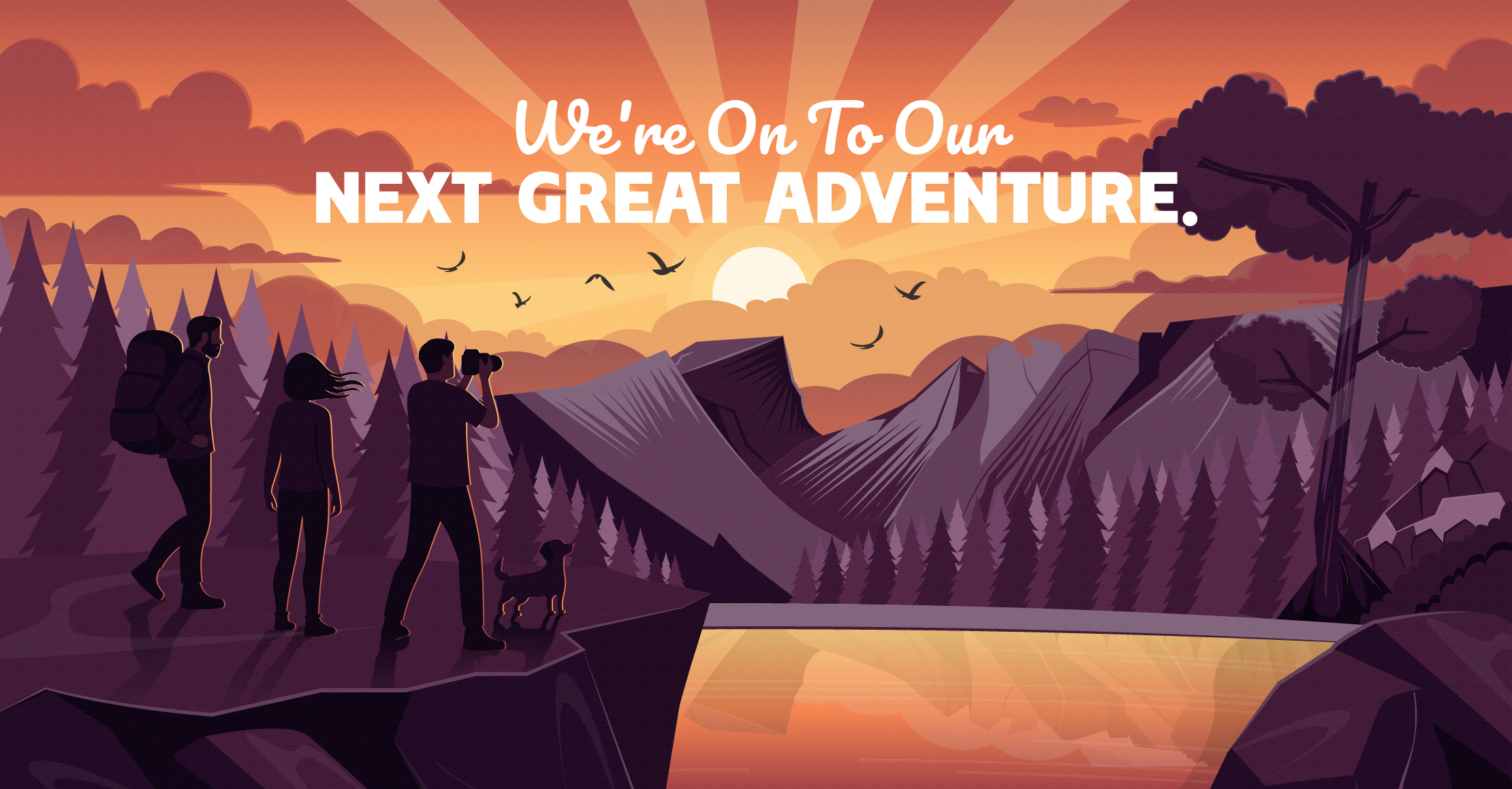

New Horizons. Same Compass.
For years, Apples & Arrows has been defined by the thrill of discovery – seeking out the “why,” aiming for the “what’s next,” and trekking through the wilderness of branding to find something truly authentic.
Every great explorer knows that the most exciting part of the journey is the discovery of a new frontier. We are shifting our focus to a new landscape at Thrive Restaurant Group, and as a result, Apples & Arrows will no longer be taking on new agency clients.
To Our Fellow Travelers
To the clients who trusted us with their vision: Thank you. You weren’t just accounts on a spreadsheet; you were our partners in the great unknown. Together, we built things that didn’t exist before, and for that, we are incredibly proud.
The Trail Doesn't End Here
While our operations are changing, our commitment to you remains steady. We aren’t disappearing into the brush. If you have questions, need guidance on a past project, or just want to check in before your next big move, please reach out. We will always be here to help navigate any challenges as we are able.
The map might look a little different now, but the destination is as bright as ever.